BOOK AND PAINTINGS: EXPERIENCING OXFORD
Categories Book: Experiencing Oxford Interview with Designer
Interview with Designer
IAN DAVIS INTERVIEWED CONOR GALLAGHER, THE DESIGNER OF EXPERIENCING OXFORD

Conor, you are an artist as well as graphic designer. I feel that the artist in you is the reason for the design of each double page spread that makes the book so attractive. How do you go about organising pages in terms of composition, colour balance, shape of book etc.?
In a book with a lot of imagery, a rhythm needs to develop throughout the book. Each double page spread is like a little scene in the overall production so the images on both sides should complement each other. We tried to make the paintings as large as possible (close to their actual size) and they often appear on their own on a page. Ian had requested that the font size be at least 11 point and that meant there would be less text per page which was a challenge but we managed it.
How did you learn the graphic and IT skills needed to design a book like Experiencing Oxford?
I studied advertising with a view to being a visualiser but over the years have veered towards graphic design and then to fine art. I have always loved books and designing one is always a challenge. The software I use is Adobe Indesign which is particularly suitable for the production of books.
Was there any difficulty of mixing photographs and paintings?
This book is firstly about the paintings and illustrations, and the photographs whilst secondary are an important addition to understanding Ian’s experience of Oxford. The paintings are reproduced as largely as possible and as the photos are less critical, it makes it easier to marry the two.
What were the particular challenges in designing this particular book?
Being such a personal journey, the first challenge was to understand what Ian was trying to convey with this book, what imagery he wanted to use and then for us to make this as interesting as possible for the reader. I think this book was a journey of discovery for both of us and the book evolved and changed as we progressed in to the various chapters.
Was it difficult to marry up the text with appropriate photographs or paintings?
At times it was as there were sometimes multiple images to illustrate a particular point. I think we fairly succeeded in marrying most of the images close to the text but I think the reader will understand the format quickly and realise that an image will be close at hand.
How did you find the experience of watching the book being printed in Malta?
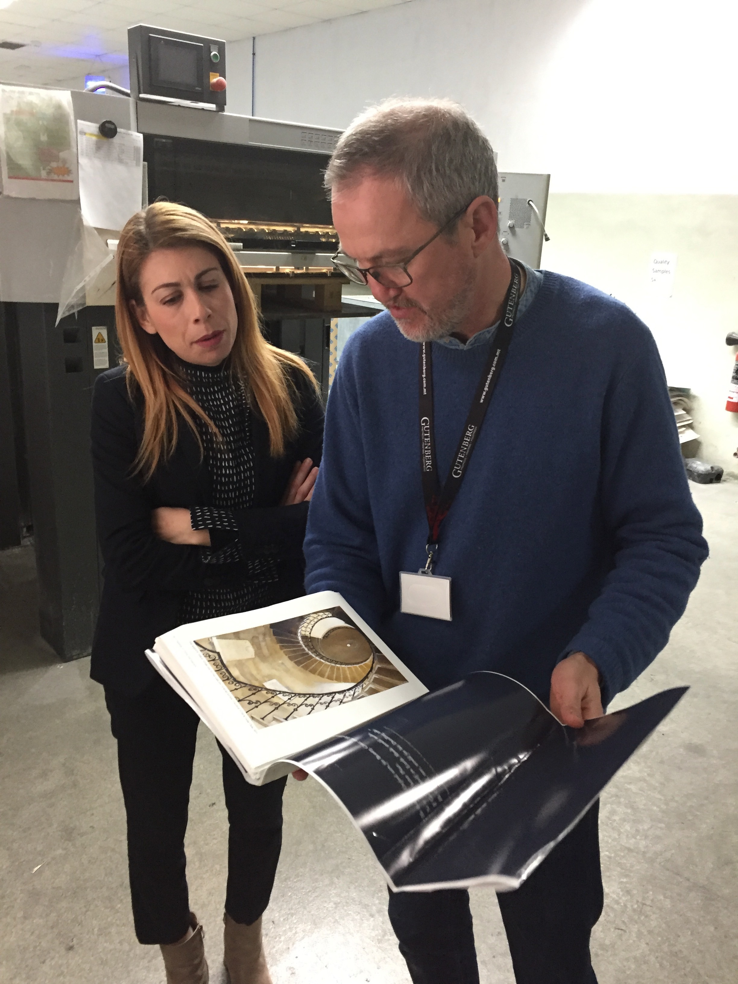
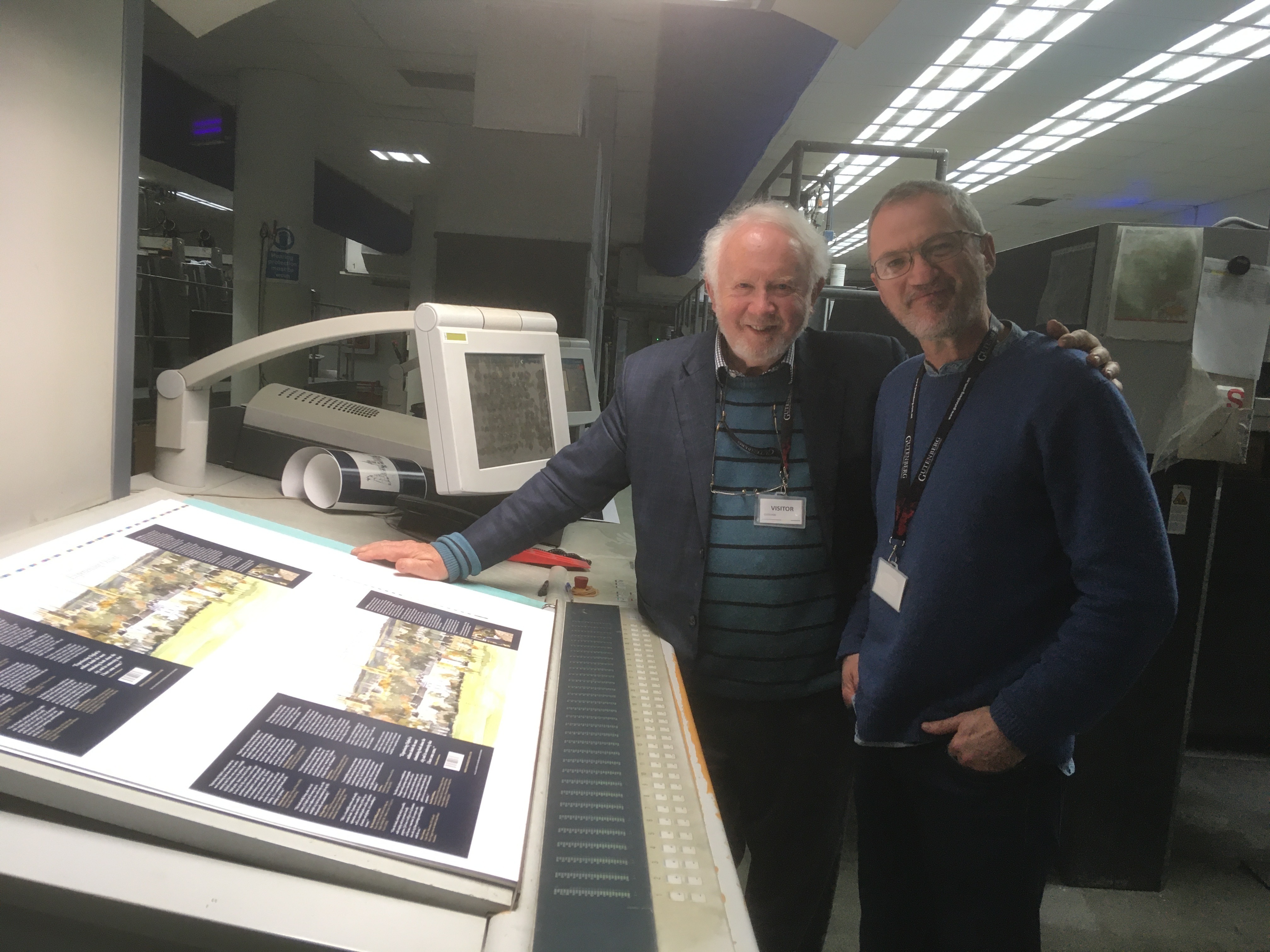
There is so much checking with a book so you are carefully watching the reproduction of the printing and making sure all is OK. It was a little nerve racking but Gutenberg’s attention to detail was excellent. It was a blast from the past to watch the proofs coming out of the printing press. As Gutenberg explained, budgets are so tight these days that proofing by the client is rarely part of the printing process which is a pity.

Which fonts are used and what was the technical quality/ definition of illustrations?
The font used in Bembo. It is a classic book font and the title ‘Experiencing Oxford’ looked so good in Bembo italic that the typeface was carried throughout. It is apt for a subject such as Oxford. To maintain a consistency of reproduction in the book, the paintings were scanned by an expert, Pierre Macke, at a very high resolution and we sat together for a few hours in a hotel lounge in Gatwick Airport matching the colour of each painting on screen by comparing it with the original painting.
To summarise, why should people buy this book?
People should buy this book because it really is unique. The painter is the author, he is an architect and an (amateur) historian who is able to convey so much personal knowledge about Oxford by including so many of his paintings and photographs to illustrate his own personal journey which is truly fascinating.
How can people contact you if they need a graphic designer, what services can you offer?
People can see my design work at www.eyecondesign.ie and paintings at www.conorgallagher.com.

